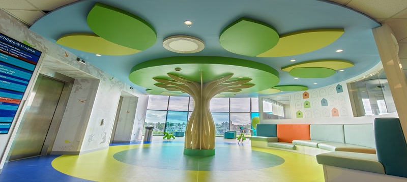
While there is no question about the importance of Hospital Design in the Patient have a much better healing experience, the role Colours in Design has not been as understood and accepted.
Color has always had a huge effect on the mood of a person. Researchers have explored this aspect and discovered that use of certain colors have an affect on physiological aspects like heart rate, blood pressure, and respiration, making it imperative to use it when designing especially Hospitals.
There are select colors that can help not just create pleasant aesthetics, but also an environment that has a positive therapeutic impact on patients, lowering their stress levels. Very much needed especially for Patients awaiting Surgery or any critical Procedure.
The right colors promote a state of calm which in turn improves the state of mind of the patient and make them accept the treatment or procedure more whole heartedly. Well-chosen wall, ceiling and even floor colors, designs for the furniture and other artefacts and their colors, can help even alter human behaviour, and improve in their recovery process.
Which Colors are used for Different Areas of the Hospital, and Why?
Red is a Colour that raises blood temperature and stimulates circulation, used in areas that care for people with anaemia, fatigue, paralysis, and exhaustion. It is also used as an indication to stop, a signal conveying danger, normally used to show Fire exits, Electrical Panels & Switches, Fire extinguishers etc.
Orange gives vitality to the body and is associated with the kidneys, urinary tract, and reproductive organs and is thus best used in Departments caring for people with such ailments. This color, Orange also is used to indicate the presence of dangerous machinery parts or equipment that can injure like exposed gears, pulleys, rollers etc.
Yellow is a color that helps digestion as well as the liver and intestine process. It is considered to have decongestant and antibacterial properties, acting as a cleanser for the body. Is known to alleviate rheumatism and arthritis. No prizes to guess the departments this color can be used in. Yellow is also used to mark areas to be cautious and hazardous. Areas in which one can trip, fall, stumble etc.
Green indicates exactly the opposite. Safety, where First aid equipment, Dispensaries, Stretchers etc are located, while Black and white and combinations of both are used to direct movement and to indicate housekeeping areas. Green promotes balance and harmony within the body, making it a good colour to use for those with heart and blood problems.
Blue is a calming, soothing color too, as it symbolizes water, the sea and the sky. Helps in lowering the heart rate and helping the body heal itself. Blue alleviate tension and stress and felt to relieve insomnia, anxiety, high blood pressure, migraines, and skin irritation.
Basic design principle should also be followed of not using too many colors - more than 3 to 4 in a single place inside the Hospital, be it a Patient Room or a Consulting room. Too many colors cause confusion in the Patient’s mind and thereby stress.
We can thus see the different emotions Colours invoke. While the Hospital needs to look good, the colors should finally be such that not only avoids stressing out the patient, but also aids in the
healing process.
Frequently Asked Questions
What are the Golden Rules for Designing Hospital Interiors?
When we design the interiors of Hospitals, we are just not choosing nice paintings and pretty furniture. Along with being aesthetically pleasing, the we ensure the Hospital has a functional environment, Read More.....
What are the steps involved in planning a hospital?
How to Start a Hospital, A hospital feasibility study is a crucial process for determining the source of patient flow for a new healthcare facility. It involves a market and financial analysis of the proposed project, Read More.....
What are the key considerations for designing boutique healthcare centers?
The Rise of Boutique Healthcare Centres: Light-Asset Models Transforming Urban Markets, In today's rapidly evolving healthcare landscape, light-asset, single or dual specialty centres are emerging as a preferred model in metropolitan areas, Read More.....
How to Optimize Hospital Emergency Department Planning and Design?
Emergency Departments (EDs), also known as Emergency Rooms (ERs), along with trauma centres, serve as the critical frontlines of healthcare facilities, they act as indispensable area during life-threatening emergencies, Read More.....
What are the Latest Architecture and Design Trends for Senior Care Centers?
India is currently at a critical juncture, grappling with a significant surge in its senior population and a strain on traditional family-based support models. Read More.....
How to Plan and Design Hospitals with NABH Guidelines?
Designing a hospital is more than just constructing walls. It's about creating a safe space where patients heal, families feel secure and doctors and nurses work without obstacles, Read More.....
Watch Healthcare Planning Seminar Videos
- Workshop on "Planning to Build a New Hospital or Upgrade on Existing One?", Watch Here.....
- Webinar on "Planning a Hospital, What you Must Know?", Watch Here.....
- Online Seminar on "What are the Challenges & Solutions for Building a Quality Hospital Cost-Effectively?", Watch Here.....
- Web Conference on "How can Small Hospitals be Built Cost-Effectively?", Watch Here.....
Contact Us for More Details


